Data Visualisation Dashboard
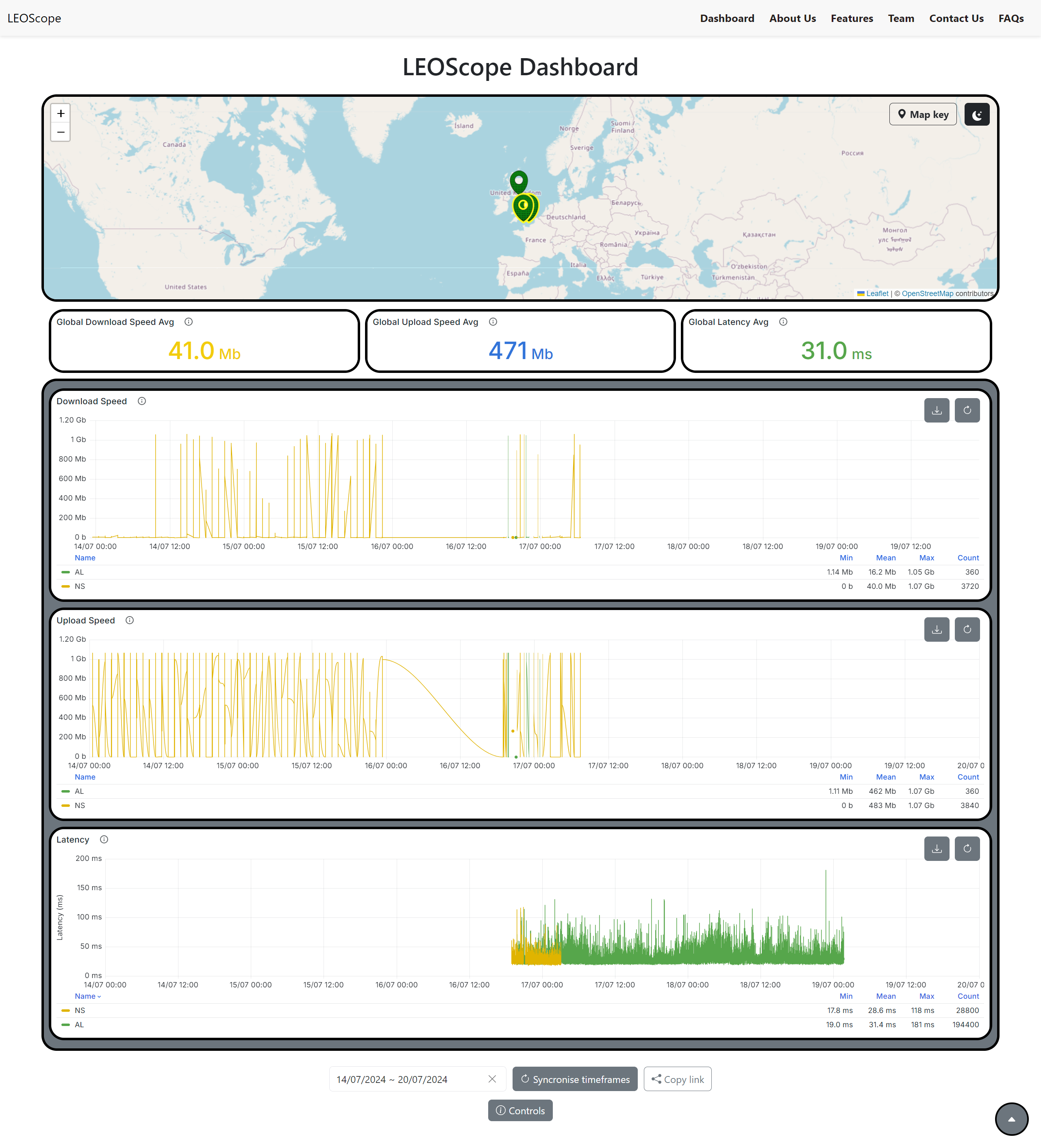
This internship project involved developing a dashboard to visualise the LEOScope testbed for STARLINK satellites worldwide. The primary goal was to enable users to easily check the online/offline status of STARLINK satellites in specific areas graphically using a map. The secondary objective is targetted at researchers, allowing users to view and download specific data, such as download speed, within a chosen timeframe. The dashboard has many other features: URL sharing with preselected nodes and time ranges, a dark theme, a small page scroller in the bottom right, a mobile-first approach and more.
This project required me to independently learn and utilise technologies such as React.js, Grafana, and Docker. While working autonomously, I effectively collaborated with my team through bi-weekly meetings and achieved our shared objectives.
This dashboard page for LEOScope can be accessed here, however the APIs and data collection methods are still under development - please bare that in mind!